コメントありがとうございます。 残念ながら、もうSlingboxを使っていないた…
レスポンシブなメニューを作成してみる
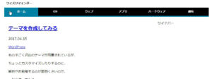
通常画面
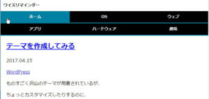
タブレット等
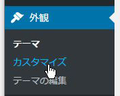
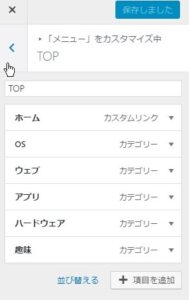
外観 > カスタマイズよりメニューを作成します

<!DOCTYPE html>
<html>
<head>
<meta charset="UTF-8">
<meta name="viewport" content="width=device-width">
<title><?php bloginfo('name'); ?></title>
<meta name="description" content="<?php bloginfo('description'); ?>" />
<link rel="stylesheet" type="text/css" href="<?php echo get_stylesheet_uri(); ?>">
<?php wp_head(); ?>
</head>
<body>

<header>

<h1><?php bloginfo('name'); ?></h1>

<?php
$nav = wp_get_nav_menu_items('TOP', array());
if($nav){
  $current_url = (empty($_SERVER['HTTPS']) ? "http://" : "https://") . $_SERVER['HTTP_HOST'] . $_SERVER['REQUEST_URI'];
  echo "
<ul>\n";
  foreach($nav as $menu){
    if(!preg_match('/\x2f$/', $menu->url)) $menu->url .= "/";
    $class = ($menu->url == $current_url) ? "current" : "";
    echo "
<li class=\"{$class}\"><a href=\"{$menu->url}\" terget=\"{$menu->target}\">{$menu->title}</a></li>

\n";
  };
  echo " </ul>

\n";
};
?>
</header>

<main>
<?php if(have_posts()): while(have_posts()):the_post(); ?>

<h2><a href="<?php the_permalink(); ?>"><?php the_title(); ?></a></h2>

<time datetime="<?php the_time('Y-m-d'); ?>"><?php the_time('Y.m.d'); ?></time>


<?php the_category(', '); ?>


<?php the_content('Read more'); ?>

<?php endwhile; endif; ?>
</main>

<aside>
サイドバー
</aside>


<footer>
フッター
</footer>

<?php wp_footer(); ?>
</body>
</html>
/*
Theme Name: YsTheme
Version: 1.0.1
Author: ysrock
Author URI: https://reminder.ysrock.com
Description: ワイズロックのテーマ
*/

body{
	margin:0 auto;
}
@media screen and (max-width:999px){
	body{
		width:100%;
	}
}
@media screen and (min-width: 1008px){
	body{
		width:1000px;
	}
}


header, main, aside, footer{
	display:block;
}

footer {
	border:1px solid #ccc;
	margin:0px 0px 10px 0px;
	padding:20px;
}

/*--- header ---*/
header{
	text-align:left;
}
header > h1{
	margin:13px 10px;
	font-size:14px;
	line-height:14px;
}
header > ul{
	box-sizing:border-box;
	margin:0;
	padding:0;
	background-color:black;
	list-style-type:none;
}
header > ul:after{
	content:"";
	clear:both;
	height:0;
	display:block;
	visibility:hidden;
}
header > ul > li{
	font-size:14px;
	line-height:14px;
	float:left;
	background-color:black;
}
header > ul > li > a{
	display:inline-block;
	font-weight:bold;
	color:white;
	text-decoration:none;
	text-align:center;
}
header > ul > li > a.current,
header > ul > li > a:hover{
	background-color:#0080a2;
}
@media screen and (max-width: 767px){
	header > ul > li{
		width:33.3%;
		box-sizing:border-box;
		border-bottom:3px solid #0080a2;
	}
	header > ul > li > a{
		box-sizing:border-box;
		width:100%;
		padding-top:13px;
		padding-bottom:13px;
	}
}
@media screen and (min-width: 768px){
	header > ul{
		height:45px;
		border-bottom:5px solid #0080a2;
	}
	header > ul > li{
		width:16.6%;
	}
	header > ul > li > a{
		width:100%;
		padding-top:13px;
		padding-bottom:13px;
	}
}
/*--- header END ---*/


/*--- main ---*/
@media screen and (min-width:400px) and ( max-width:709px){
	main{
		width:100%;
	}
}
@media screen and (min-width:710px) and ( max-width:999px){
	main{
		margin:20px 0 0 20px;
		width:690px;
	}
}
@media screen and (min-width: 1000px){
	main{
		float:left;
		margin:20px 0 0 20px;
		width:690px;
	}
}
/*--- main END ---*/


/*--- aside ---*/
@media screen and ( max-width:999px){
	width:100%;
}
@media screen and (min-width: 1000px){
	aside{
		float:right;
		margin:20px 0 0 20px;
		width:250px;
	}
}
/*--- aside END ---*/


footer{
	clear:both;
	text-align: center;
	padding: 10px;
}?
検索

最近のコメント
最近の投稿
タグ
フィード配信
アーカイブ
外部リンク

コメントを残す